
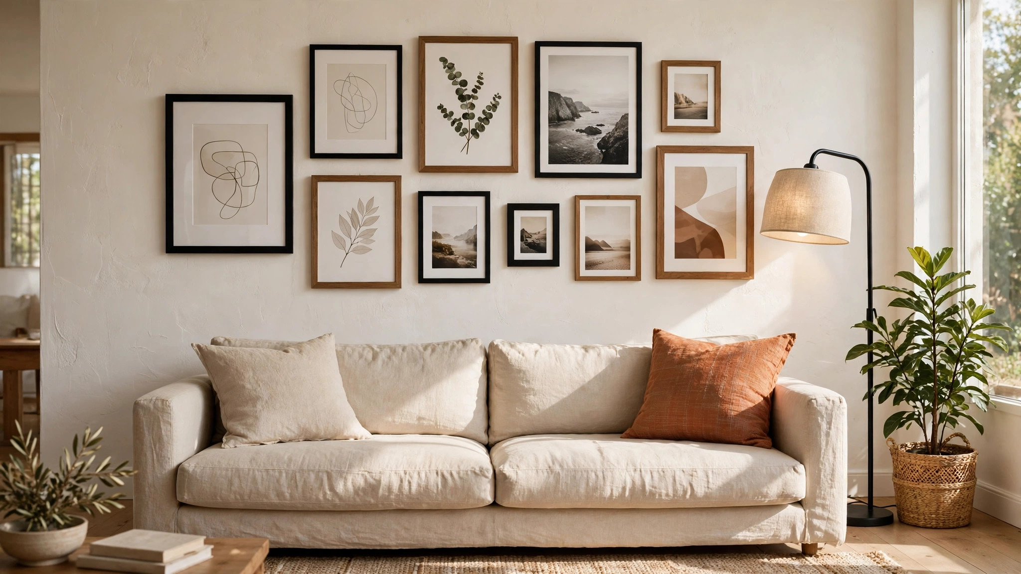

A gallery wall can turn a blank stretch of drywall into the most personal part of your home. It can also, done carelessly, look like a cluster of frames that drifted together by accident. The difference is almost never the art itself. It is the gallery wall layout: the shape of the arrangement, the spacing between frames, and the height at which the whole group hangs.
The encouraging news is that layout follows a handful of dependable rules used by museums and professional installers. Learn the numbers, choose a layout style that suits your collection, and plan the whole thing on paper before the first nail. Here is the complete method, from choosing a style to hanging the last frame straight.
Photo Wall Styles: Grid, Salon, and Staircase Layouts
Every successful photo wall belongs to one of a few layout families. Pick your family first, because it decides everything downstream, from frame shopping to spacing.
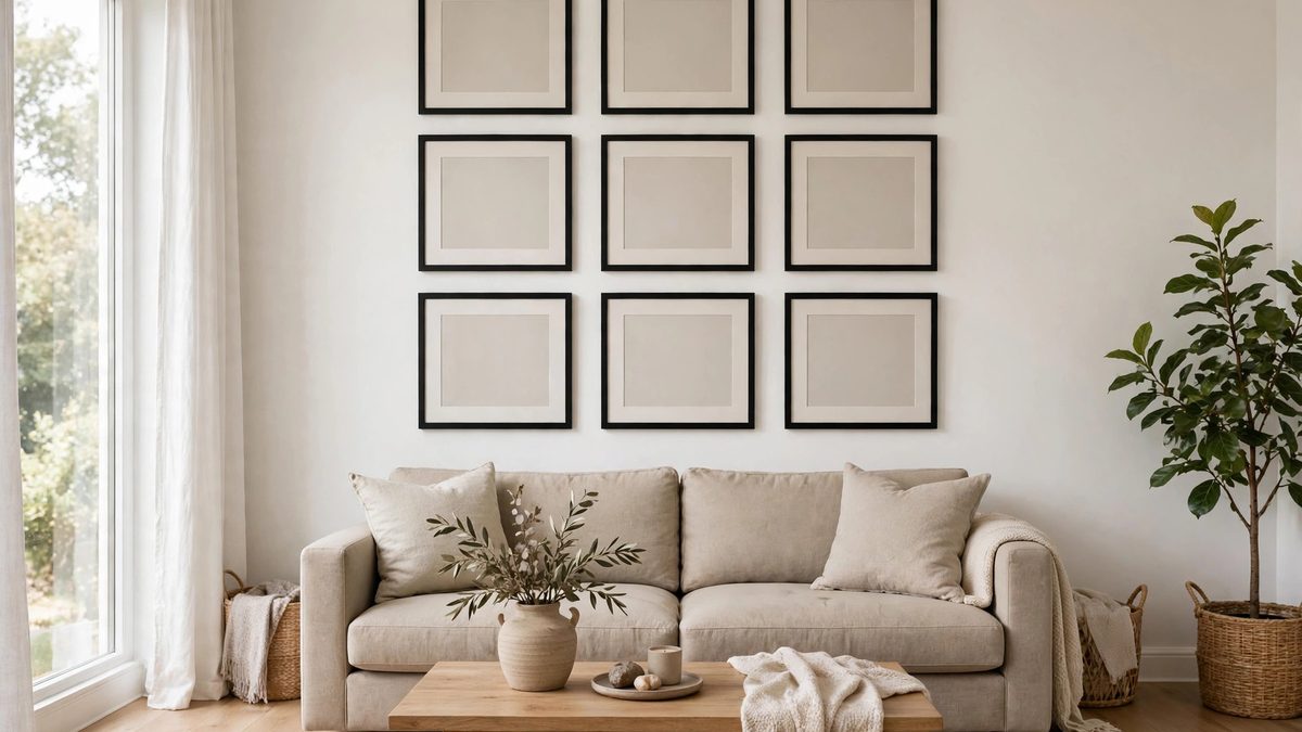
The grid. Rows and columns of identical frames with identical spacing. Grids are the most formal option and suit a true series: matching travel photos, botanical prints, or a run of family portraits in the same finish. Precision is everything here. One crooked frame breaks the spell, so a level and careful measuring are non-negotiable.
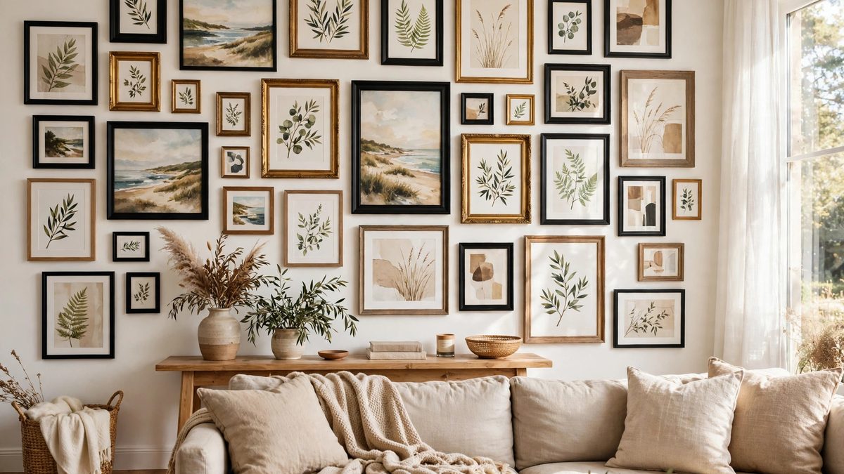
The salon (eclectic) layout. Mixed sizes, mixed frames, arranged organically around one or two large anchor pieces. This is the most forgiving style, because variety hides small imperfections, and it is the best choice for collections built over time. Keep one element consistent, such as black frames, all-white mats, or a shared color palette, so the mix reads as curated rather than random.
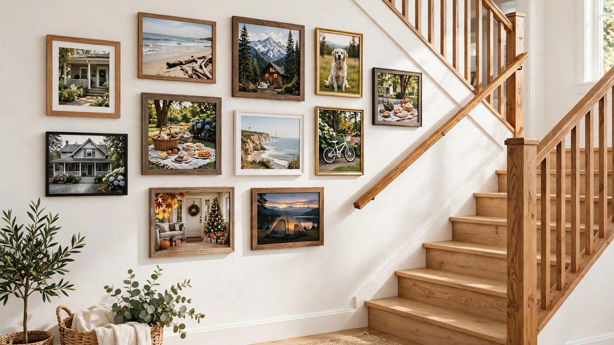
The staircase layout. Frames follow the diagonal line of a stairway, each step’s frames rising with the treads. Keep the bottom edges of the arrangement roughly parallel to the handrail, and repeat the same gap between the frames and the stair line as you climb.
The symmetrical pair or row. Two to four frames in a clean line above a sofa or console. Simple, calm, and ideal when the wall or the furniture below it is the real feature.
Whatever the style, odd numbers, five to seven pieces, are easiest to compose in eclectic layouts, while grids shine in even counts of six, eight, or nine. If you are still choosing the art itself, our guide to living room art covers subjects and sizing in depth.
The Art Wall Math: Heights and Spacing That Always Work
Three numbers do nearly all the work on any art wall, and they are the same numbers professionals use.
Center the arrangement at 57 inches. Measure from the floor to the center of the whole grouping, not to any single frame, and put that center at about 57 inches. That is average eye level and the standard museums hang by. On walls where people mostly sit, such as behind a sofa, the arrangement can sit a touch lower, but 57 inches is the reliable default.
Keep 2 to 3 inches between frames. Uniform gaps fuse separate frames into one composition. Gaps much wider than 3 inches make pieces look like lonely islands; much tighter and the wall feels cramped. Pick one gap, 2 inches is the most common, and hold it everywhere. A roll of painter’s tape makes a perfect physical spacer.
Relate the group to the furniture. Above a sofa or console, the whole arrangement should span about two-thirds of the furniture’s width, and the bottom edge of the lowest frame should rest 6 to 10 inches above the furniture’s top. The Frame Shop’s guide to hanging height and spacing walks through the same math with diagrams if you want a second reference.
Frame size mixes that behave well together include one large piece around 24 x 36 inches, a couple of mediums at 16 x 20 or 18 x 24, and smalls at 8 x 10 and 5 x 7 to fill the rhythm. Place the largest piece slightly off-center or low-center, where the eye lands first, and build outward.
Picture Ledge Displays for Commitment-Free Styling
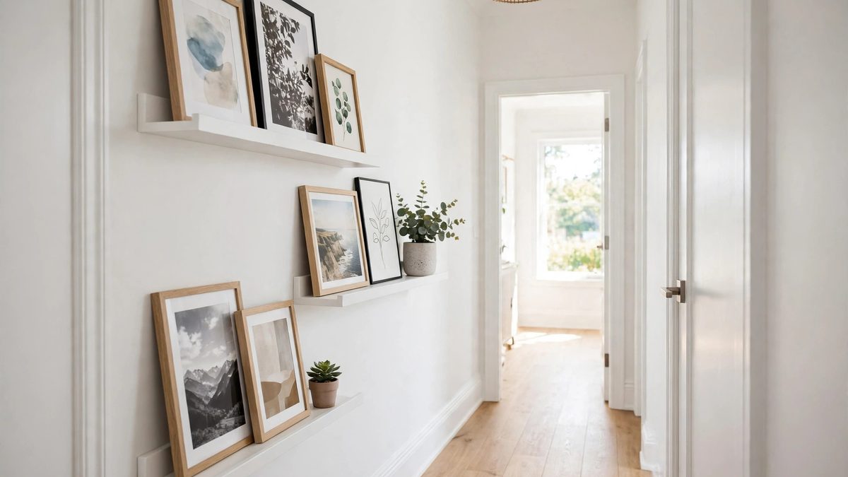
If the thought of fifteen nail holes makes you hesitate, a picture ledge (or two) gives you the gallery effect with total freedom to rearrange. A picture ledge is a shallow shelf, typically about 4 inches deep, with a small front lip that keeps frames from sliding. Ledges commonly come in lengths of about 2 to 4 feet and can be mounted singly or stacked in pairs.
Layer frames along the ledge, overlapping a small frame in front of a larger one for depth, and mix in a small plant, a candle, or a stack of art books to break up the row of rectangles. Because nothing is nailed, renters love ledges, and so does anyone who likes to rotate seasonal prints and family photos through the year.
Hang ledges with the same math as frames: the center of the finished display near 57 inches, or the top ledge about 6 to 10 inches above the furniture below. One caution: ledges hold less weight than studs and anchors, so keep heavy, oversized framed pieces for direct wall hanging.
Plan It on Paper Before You Touch a Hammer
The step that separates calm gallery walls from patch-and-repaint weekends is the paper template. Trace each frame onto kraft paper or painter’s tape outlines, cut them out, and tape the templates to the wall in your chosen arrangement. Mark each template’s hanging point, the spot where the hook will actually sit, which is below the top of the frame by the depth of its wire or hanger.
Live with the templates for a day. You will notice if the group is too high, too wide for the sofa, or fighting a thermostat, while the fix still costs nothing. Then hang the largest anchor piece first and work outward, checking the 2- to 3-inch gaps as you go. This template method is also how the pros handle tricky walls like the long ones in our wall design ideas guide.
Gallery Wall Mistakes to Avoid
- Hanging the group too high. The center belongs at eye level, around 57 inches, not up near the ceiling where necks crane.
- Inconsistent spacing. Random gaps are the number one reason gallery walls look accidental. Choose one gap and repeat it exactly.
- Going wider than the furniture. A display wider than the sofa below it looks top-heavy and unanchored. Aim for roughly two-thirds of the furniture width.
- Too many small frames. A wall of only 5 x 7s reads as clutter. Mix sizes and include at least one substantial anchor piece.
- Skipping the template step. Every patched hole in America started with someone saying they would eyeball it.
- Ignoring the room’s other walls. A gallery wall is a feature; pairing it with a competing feature wall nearby (like the busy ones in many dining room wall decor ideas) can overwhelm both rooms.
Growing Your Gallery Wall Over Time
A gallery wall does not have to be finished in a single weekend. Start with your strongest three to five pieces, hang them well, and live with the arrangement for a while. Add new finds one at a time, keeping the same spacing rhythm, and the wall will grow into a collection that tells your story.
Frequently Asked Questions
How high should a gallery wall be hung?
The center of the entire arrangement should sit about 57 inches from the floor, which is standard eye level. Above furniture, keep the bottom of the lowest frame 6 to 10 inches above the furniture and let the center land where it naturally falls.
How far apart should gallery wall frames be?
Keep a consistent 2 to 3 inches between frames. Two inches suits tight grids, three inches suits larger frames and more relaxed layouts. Consistency matters more than the exact number.
How many frames do I need for a gallery wall?
Five to seven pieces compose easily for most living room walls. Grids look best in even counts like six or eight. What really matters is total footprint: the group should cover a satisfying share of the wall, roughly two-thirds the width of the furniture below it.
Do gallery wall frames have to match?
No. Matching frames give a formal grid look, but mixed frames work beautifully when something unifies them: a shared color family, consistent mats, or a common theme in the art. Limit frame finishes to two or three so the variety looks deliberate.
Can I make a gallery wall without nails?
Yes. Picture ledges are the most flexible nail-free option. Heavy-duty adhesive picture strips also work for lighter frames, many are rated for pairs holding up to roughly 16 pounds, provided the wall is clean, smooth, and fully cured paint. Always check the rating on the package for your frame’s weight.
Conclusion
A gallery wall is a layout problem with a known solution. Choose a style family that fits your collection, center the whole arrangement at 57 inches, hold a consistent 2- to 3-inch gap, size the group to two-thirds of the furniture below, and plan it in paper before a single hole is drilled. Do that, and the frames stop looking like they accumulated and start looking like they were composed, which is the entire difference between a wall of pictures and a gallery.
